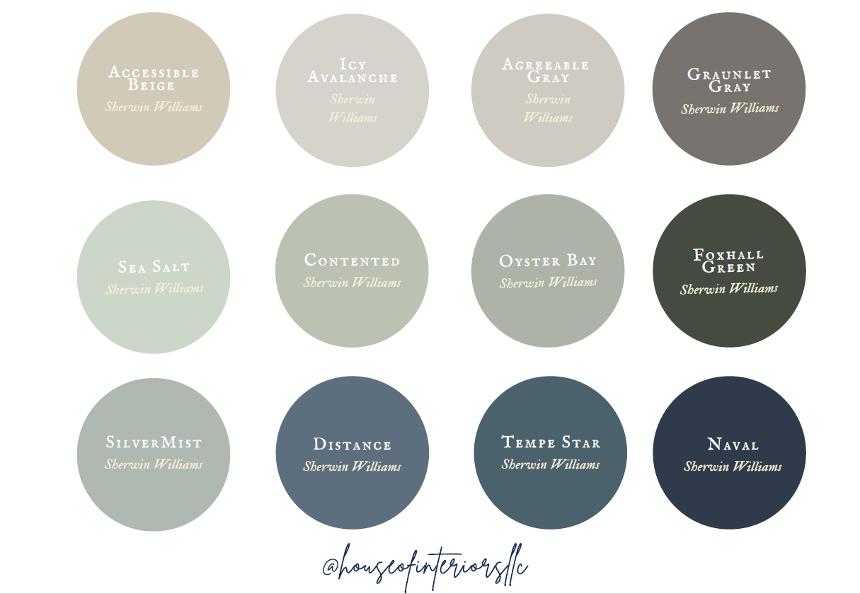
DESIGNER PICKS FOR PAINT
While I had my reservations about about creating this post, I decided to be generous. Over the years I’ve learned which paints work best for different areas and how to make a home flow together well. There are so many factors that contribute to a cohesive space, including square footage and lighting. And there’s ultimately the feeling you are hoping to achieve while in the space that counts most. Colors like a Accessible Beige and Agreeable Gray are pretty much no fail colors. They usually work with warmer beiges and grays.
Every color on the color wheel as a cooler tone and a warmer tone, and that’s where the trick lies. When selecting furnishings you have to make a decision where or not your walls, furnishings, and accessories are all cooler tones. Even when looking a color swatches from Sherwin Williams or Benjamin Moore you’ll notice the colors range from lighter to darker, staying cool or warm. When you mix a cooler version or blue with a warmer version of green the colors don’t blend.
Here I’ve included the colors Contented, Oyster Bay, Foxhall, Distance, Tempe Star, all for which would be considered warmer tones. Whereas Naval and Silver Mist along with Sea Salt land on the cooler spectrum.
If you home doesn’t have as much natural light consider keeping the walls a light tone. If you do have tons of natural lighting feel free to go darker in some areas. Darker colors have a strong wall of influencing mood. They tend to create a more intimate and sophisticated space.
Here are some examples of how darker wall colors create sophistication.
Here are some examples of how lighter wall colors make rooms feel bigger and brighter.
HOUSE OF INTERIORS, LLC


